Four Design Trends that Aren’t ADA Compliant and Good Alternatives
Web design is a constantly evolving space that’s seen the rise of plenty of trends over the years. And while the hot new trend on the block is always exciting, a lot of fads don’t have the practicality to stay relevant for long. And there are plenty of trends going around now that are no exception to the rule.
We’ve noticed four design trends recently that people love but have one massive flaw: poor ADA compliance. For as cute and fancy as a lot of these hot new design trends are, they’re bound to fall from grace with how inaccessible they are to a lot of users.
To show you what we mean, let's look at four of the most popular, non-ADA-friendly design trends currently circulating, express our concerns about them, and show you some equally aesthetic alternatives that comply with accessibility standards.
1. “Aesthetic” Neutral and Light Color Palettes

A selection of trending light and neutral color palettes on Coolors.
Websites with neutral and light-colored palettes have become all the rage recently, and we totally get why. We love cute, colorful color palettes and websites as much as the team, but there’s also a big reason we see these trendy looks as fads more than staples of the design space. Simply put, these bright and “same-y” color palettes don’t have a high enough color , and all the written content on the site won’t be able to stand out from the background because of it.
WCAG Level AA requires at least a 4.5:1 color contrast ratio between your text and the background color behind it, while you’ll need a 7:1 color contrast for Level AAA. You can achieve each in a few ways, but none include slapping light-colored copy on a light-colored background. The similar shades will blend, and your audience will have to strain their eyes just to read your copy (if they can read it at all).
While neutral and light color palettes are trendy right now, the same rules apply to dark-on-dark color schemes too. You need your text to clearly stand out from your background for an ADA-compliant website, and many of these contemporary color schemes just don’t do the trick.
If you’re unsure how well your text contrasts your website’s background, try Coolors’ color contrast checker!
2. Cute But Illegible Scripts
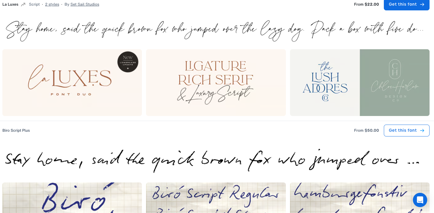
Some stylish scripts available for purchase on MyFonts.
Everyone is looking for a way to make their website stand out, and one of the most effective ways to achieve that design independence is to use a unique, distinct font. But we’ve noticed that some people overcorrect here and opt for designer scripts that have a palpable style but aren’t easily legible over simple fonts that everyone can read.
This doesn’t mean that your website copy shouldn’t look pretty, but it is to say that it's more important to communicate that copy clearly than it is to use a good-looking font. You don’t necessarily have to settle for Times New Roman or other overused fonts for your website copy, but if your text is over-stylized or improperly formatted, it might be too difficult to read.
We recommend avoiding fonts with poor spacing between characters, letters that look too similar (such as I’s that look identical to L’s), characters that deviate too far from how they look in standard print, and letters that are too “loopy” or “frilly” or look handwritten. There isn’t a concrete way to determine which fonts you should avoid, but we can confidently say most commonly used fonts are ADA-compliant.
The commonly used fonts like Arial and Times New Roman are also often easier to read because almost everybody has seen them before. Most people know what every character in these fonts looks like, but it won’t be as clear with scripts people aren’t familiar with.
3. Small or Thin Body Fonts

A screenshot of some free font styles available on Google Fonts.
This design trend is similar to using overly-designed scripts that look good but are just too hard to read. An undersized or super thin font for your body copy might look nice, but more often than not, they’re just too hard for people to read.
We recommend going no smaller than 12-point (or 16-pixel) font for your copy. But that doesn’t necessarily mean you should blow up your font as big as possible. WCAG also wants users to be able to resize a website’s body copy by up to 200% without losing the content or functionality of a page for Level AA compliance, so you don’t want to oversize your font to the point where your audience can’t read a single word without scrolling.
Thin fonts are just as bad as undersized ones for the same reasons. Your users need to be able to read your copy clearly and quickly, and thin fonts that don’t stand out on the screen will keep people from easily comprehending the text. You don’t need to put every sentence on your website in bold font, but make sure the characters have enough weight that they’re clearly readable as soon as you see them.
4. Text Layered Over Images

Some fonts from MyFonts layered over images.
The final contemporary design trend we can’t recommend is layering your text over important images. In theory, this might sound like a great way to draw attention to important copy and make your pictures more dynamic. But in practice, it detracts from both the text and pictures more often than not.
Not only does the text obstruct your pictures so that users can’t see everything in the image, but the images in the background can make the text harder to read. It’s best to keep your copy layered over a solid background and your pictures left unobstructed so they’re both clearly visible. But if you’re set on this design trend, there are ways you can make it work.
One option is to add an opacity layer to your images, either a light one if you’re using dark-colored text or a darker layer for light-colored text. This will make your pictures less visible but bring more of a solid color, that way the text has an easier time standing out. You can also alter the text with a border or shadow, but we prefer the opacity layers if you’re going to put text over an image.
There’s no such thing as the perfect design trend, but there are definitely some that are more sustainable than others. Typically, the trends with an emphasis on accessibility over passing design fads are the ones that last, and we hope this post helped guide you to design choices that everyone can enjoy.