Understanding Some Lesser-Known WCAG Compliance Guidelines
It’s crucial to keep your website accessible to all users so that everyone who wants or needs your services can access them comfortably. Most web designers understand this and do their best to comply with the Americans with Disabilities Act (ADA) when designing their pages. However, despite many people’s best efforts, plenty of web pages are missing some of the most important accessibility features.
The Web Content Accessibility Guidelines (WCAG) set the regulations for what features and layouts web pages should have to stay accessible. It’s these regulations that determine a website’s ADA compliance level. Level A represents the minimum effort for accessibility features, Level AA is the second tier, while Level AAA is the peak. Of course, we recommend abiding by as many accessibility recommendations and regulations as possible. Not just because they’ll keep your website accessible to more people, but also because you could actually be sued if you don’t provide appropriate accommodations for all users. Just like how physical buildings need accessible entrances and walkways, your website needs to have accessible content and navigation.
Though many people aim for Level AAA, they often fall short because of how many requirements it takes to get there. Some Level AAA guidelines are obvious, while a few are easy to forget despite their importance.
So today, we wanted to highlight six of the lesser-known WCAG guidelines that can help you reach that all-important Level AAA.
1. Reading Level
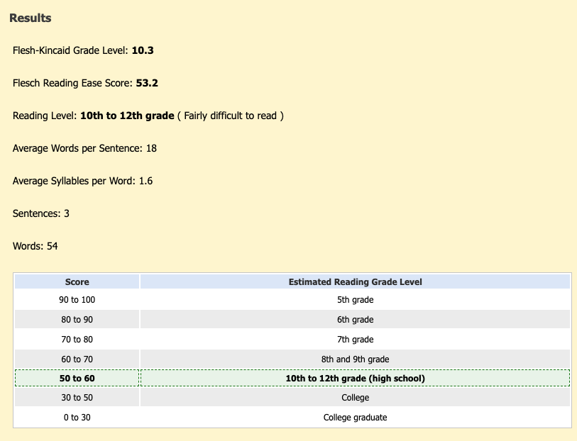
The results from a Flesch-Kincaid test on a three sentence passage.
The most impactful way to make your content more accessible is to write your web copy so everyone can easily understand it. You can do this by avoiding unnecessarily complicated or hard-to-define words, using short sentences and paragraphs, and avoiding massive walls of text on pages that don’t need it. This will keep everything easy to understand and follow along with.
WCAG recommends keeping your copy around a “lower secondary education” reading level, which they define as around 9th grade. It can be tough to determine what reading level you’re writing at, but the Flesch-Kincaid test can give you a rough estimate.
There are a billion accessibility reasons why you should keep your copy around a high school comprehension level, but there’s one more big reason beyond those: overly verbose copy is just bad business. There’s no quicker way to lose someone’s interest than speaking to them with fluffy, indirect language that only a tiny portion of your audience can understand in the first place.
Jargon and Abbreviations
Though your industry’s technical terms and abbreviations might feel like common knowledge to you, people outside your profession are bound to get confused if you reference them without any explanation.
If possible, we recommend avoiding all jargon and industry-specific terminology. It just makes your writing more inclusive and easier to understand. But if you have to include jargon in your copy, make sure to explain it all thoroughly. It’s similar with abbreviations. Include them if you must, but write what the abbreviation stands for (with the abbreviated format next to it in parentheses) for clarity.
2. Clear Audio on Video and Sound Recordings
There are a lot of internet accessibility rules around audio recordings and videos; one of the most important is that all your videos and recordings have clear, easy-to-understand sound with no distracting background noise. If your audio is muffled or clouded by background chatter and sounds from the surrounding environment, it can be difficult for people with hearing impairments to understand.
You should always record your audio in as quiet an environment as possible to eliminate background noise. And if you choose to play music over your audio, make sure it’s muted enough to not interfere with the dialogue.
Reminder: Captioning your audio and videos is crucial for ADA compliance, even if they have clear sound. Be sure to transcribe all video content, and don’t just rely on auto-generated captions, as they’re often error-filled.
3. No Strobes or Flashing Content
Any flashing content on your web pages, especially flickering lights or colors, can harm users susceptible to epilepsy or seizures. The best thing you can do is remove all flashing content from your pages. But if you need flickering lights or colors on your website, limit it to three flashes per second at most.
4. Color Contrast Ratio of 7:1
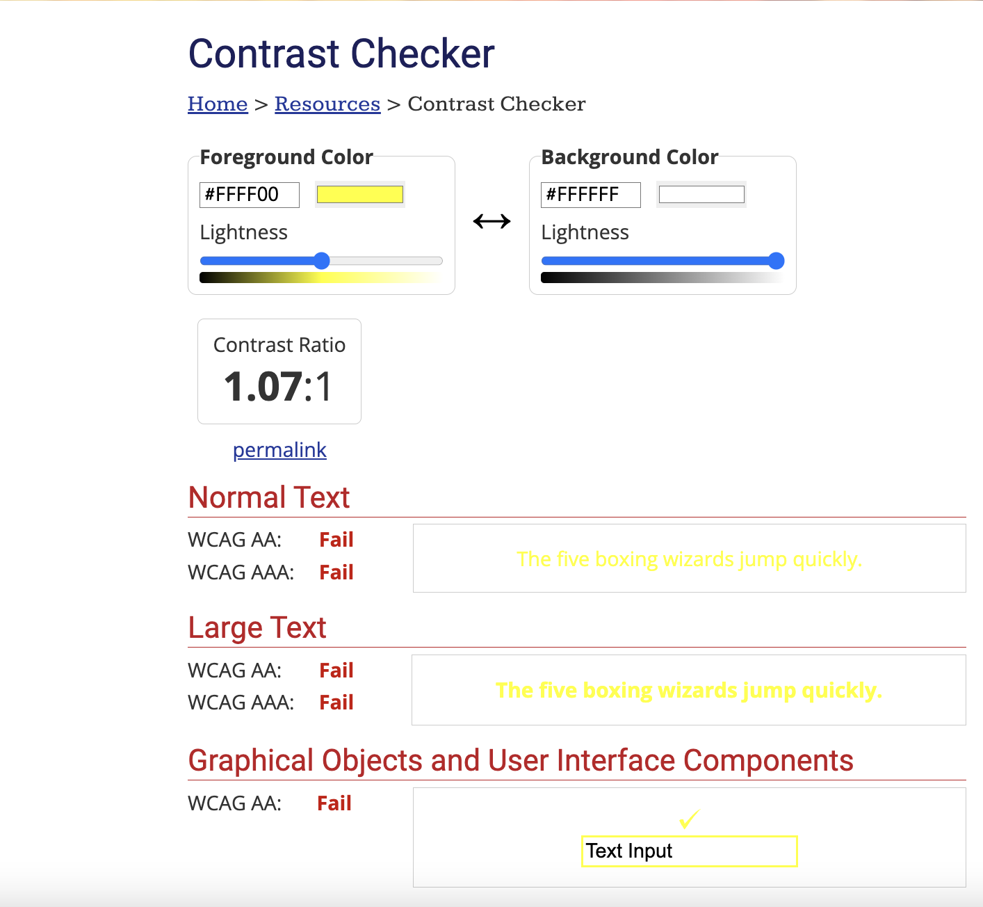
An example of what a failed color contrast ratio test looks like.
Though this is one of the more fundamental ADA compliance requirements, it might be unclear what it means if you don’t have a background in design. Basically, finding the perfect color contrast ratio is about selecting a color scheme that keeps your visuals from blending into your website’s background.
A color contrast ratio represents how well the color of your text stands out against the color of the background. For example, if your webpage has a white background and bright yellow font, it will have a poor contrast ratio because those colors are so similar that it will be hard to see the text. But black text like this against a white background is easy to read because of the contrast between the colors.
Though 4.5:1 is the most common contrast ratio for most websites, a 7:1 ratio is standard for Level AAA websites. You can compare the contrast ratio of traditional colors here.
5. Keyboard Accessibility
Most people who can’t comfortably use a mouse to navigate websites rely on their keyboard for that all-important task. That’s why keyboard accessibility is one of the most crucial elements to building an ADA-compliant website, but it’s also something many people either ignore or put half-effort into.
So here are a couple of tips for making your website as keyboard accessible as possible:
Avoid Keyboard Traps
A “keyboard trap” is a page or tool a user cannot navigate using just their keyboard. Some common keyboard traps are forms, calendars, and dialogue boxes. Make sure that EVERY element of your website is keyboard-friendly.
Keyboard Focus
An example of Keyboard Focus with the focus over the ‘Accessibility Audits’ tab.
Most people who use keyboards to navigate websites use the “tab” button to bounce around pages. When a website is keyboard accessible, the tab button will highlight a link or interactable element and let you interface with it by hitting the “enter” button. That highlight is called the “keyboard focus,” and it informs users what button the tab key is focusing on.
In most cases, the keyboard focus appears as a box around whatever element you’ve tabbed over to. However, we recommend also underlining the focus element and ensuring that both the box and underline match the recommended 7:1 color contrast ratio.
Easier Navigation
Moving through a webpage with a keyboard isn’t as fast or precise as scrolling through with a mouse. However, you can make things easier for keyboard users on certain pages by adding a “skip section” or “skip to content” button.
The best example of this is if you have a page with multiple headings, you can add a button for each one that lets users bounce directly to specific sections rather than repeatedly tapping the arrow key.
6. Data Entered on Forms Saves
Even if your website is accessible in every way we’ve discussed, it can still take time to complete forms if you struggle to use a traditional mouse and keyboard. That makes pages that time users out for inactivity challenging to use if the website doesn’t save data after refreshing. To keep your site accessible, make sure it auto-saves whatever data users enter.
Similarly, time limits on pages are often a barrier to reaching a higher ADA compliance level. You can get around this by removing timers or letting users adjust the timer length.
Some Final Thoughts
There are a lot of WCAG requirements for reaching a Level AAA-compliant website. And though these often forgotten steps can take your web presence a long way, there’s a lot more you’ll need to do to achieve that coveted Level AAA accessibility. You can read more about the WCAG accessibility guidelines here.
But more important than reaching a Level AAA rating is ensuring that as many people can comfortably use your website as possible. Even if these steps don’t take you to AAA, they will drastically improve the overall user experience, and that’s always worth the extra effort!


